Close This site uses cookies. If you continue to use the site you agree to this. For more details please see our cookies policy.

Search

Type your text, and hit enter to search:

GDP - a long way to catch up

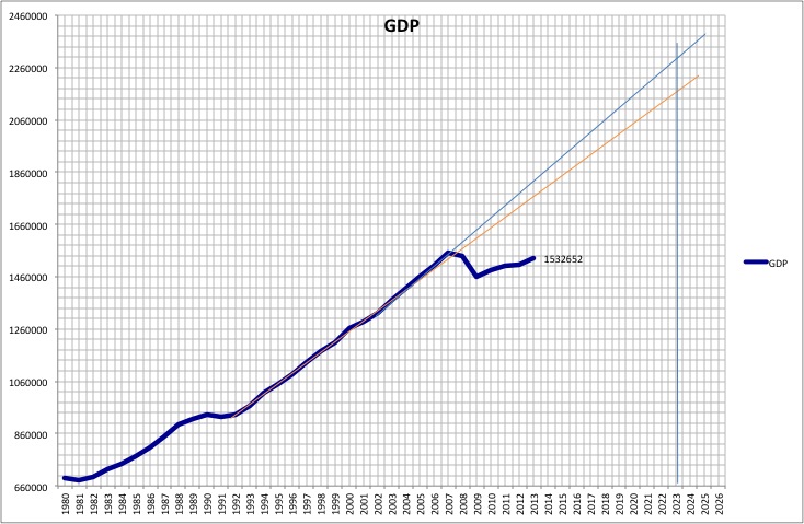
Such was the dent to GDP following the financial crisis and subsequent recession that GDP is much lower than it would have been if the pre-crisis trend had continued.  The chart below shows how wide the gap is. The orange line is an approximate trend line for the growth between 1992 and 2007. The light blue line is from the early 2000s to 2007.

GDP since 1980
Stephen Beer, 17/09/2014

 
Fiscal targets explained...
What those deficit figures are about.
Labour deficit cutting - the £50bn question
Where the £50bn figure comes from.
Targets missed
The Coalition has missed its original fiscal targets significantly. Here is a look at the official forecasts from June 2010 and March 2014, ahead of the Autumn Statement this week.
A depressing chart from the Office for National Statistics.
We were going to scrap more RAF planes...until the government realised it needed them.
Our air force is a lot smaller than it was - a lot smaller. Somewhat sobering.
Latest revisions but still a poor picture.